Web Design Retrospective: The Mues

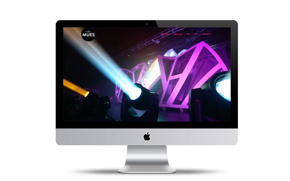
Web address: TheMues.com (note: autoplay video)

Custom Theme: Impreza for Mues

Lauren has the knowledge and flexibility to create an original website for my business and made it better than I had it planned out to begin with.” — Toby Mues

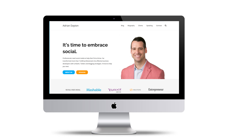
Three years ago, I met Toby Mues at a DC WordPress meetup. I was looking for new clients, and he just happened to be looking for a web designer. Since then, I’ve designed two websites for his video and photography business, The Mues Productions.

This year, we worked on a redesign of the old site that I built for him in early 2015. As Toby focuses more deeply on multimedia, he wanted his video work to be front and center. The result is an auto-play reel that is the first thing the viewer sees upon visiting the site.

Once again I built this theme on top of my old standby, Impreza. My clients love how modern it looks, and I love how easy it is to customize for a variety of different stylistic and behavioral demands. At this point, I’ve built it around four very different looking websites and I haven’t used all of its capacity yet.

(I just noticed Impreza is 50% right now so I went ahead and bought a backup license. I’ll almost definitely use it for a future client, and now I can give them a discount.)

Since I’m so used to working with the base theme, the Mues redesign was less about technological problem-solving and more about experimenting with an increasingly dramatic color palette. Toby’s clientele is mainly focused on the entertainment industry, so he could afford to be a little bold.

And of course, having all of Toby’s gorgeous photos and videos to work with made my job easier. I let his creations set the tone of the redesign, and just focused on what I could do to make them shine.

Web Design Retrospective: Adrian Dayton

Web address: AdrianDayton.com

Custom Theme: Impreza for Adrian

Does this theme look familiar? It’s a customized version of the same theme I used to make custom looks for Otaku Journalist and Gunpla 101. The base theme, Impreza, costs $60, but I’ve bought multiple licenses for my own sites and for clients’ sites because it’s so darn versatile.

This site was a long time in the making, and not just because its namesake, Adrian, is wildly successful and kept jetting off for speaking tours. The pre-redesign version of the site looked very different and had very different goals. Here’s a Wayback Machine recovery from April:

My early designs worked hard to preserve the textbook aesthetic of this site’s title page, but with modern sensibilities. (Most importantly, I recreated the embossed text effect using CSS3 instead of a JPEG so it would be better for SEO and look better on different screen sizes.) But each iteration looked sort of stodgy, unfitting for a man who runs a cutting-edge tech startup.

In the end, the final design is directly inspired by ClearView Social, Adrian’s social media startup for lawyers. Instead of looking for consistency between Adrian’s blog design and his lawyerly profession, we aimed for synergy between his blog’s design and his company site’s design.

The other completed objective—ditching that clutter. The old design had nine menu options, plus a lengthy first page that included all of Adrian’s accolades, and even a sidebar with awards and calls to action (for example, to read his book). With the new site, we trimmed down the calls to action to two, so visitors don’t have to make quite so many choices, and doubled up on white space to enhance the feeling of breathing room.

This went through more design iterations than my average redesign, but in the end it turned out to be one of the least technical. All of the changes I made were to the CSS and JavaScript—all the PHP is original to WordPress. All’s well that ends well, and I’m happy to have helped Adrian design a blog that’s more consistent to his brand.

Web Design Retrospective: Gina McGalliard

Web address: GinaMcGalliard.com

Custom theme: Birch for Gina

Every time I build a WordPress website, I learn how to do something I previously thought was impossible. It was no different with GinaMcGalliard.com, a personal journalism portfolio.

Gina is a woman of many interests. She’s an Irish dancer, an animal lover, a wellness reporter and a feminist blogger. And naturally, she wanted her new website to be just as multitalented as she is. This meant making the portfolio do double duty as not one, but two different blogs. These two blogs, Formidable Feminism and the Wellness Writer, also needed their own unique looks.

Traditionally, one WordPress installation results in one blog. And internally, GinaMcGalliard.com is just one MySQL database in the back. However, I was able to add conditional rules to WordPress’s built-in category option in order to not only make different posts show up on separate pages, but even appear with different fonts and colors.

<?php if(in_category(get_category_by_slug('feminism')->term_id)):
 the_title( '<h2 class="entry-title post-cat-feminism"><a href="' . esc_url( get_permalink() ) . '" rel="bookmark">', '</a></h2>' );

Above is the first part of the code influencing this condition. It’s a PHP if statement that applies a condition, a link, and CSS classes to posts that are in the “feminism” category. All Gina has to do is tag a post with “feminism” in order for it to show up on the Feminism blog only, with purple font.

To find out more about how to use conditionals, WordPress provides some excellent documentation on working with conditional tags. I used the Category section, obviously.

Even though the blogs each have their own flair, I maintained the bold green title bar on every page to lend consistency to the design. Just like Gina is a woman who can do many things, this website is a multitasker just like her, and I wanted visitors to be able to see that.

Web Design Retrospective: Liberal Currents

Web address: LiberalCurrents.com

Custom theme: Laza News for Liberal Currents

WordPress does a lot of neat things right out of the box. But my work as a developer shows me exactly where its limits are, and how to surpass them. With Liberal Currents, I enhanced the way WordPress deals with authors.

On its own, WordPress assigns a single author to each blog post or page. But Liberal Currents is a collaborative effort, and my client, Adam Gurri, foresaw authors working with one another on the same post. Thus, he wanted a post to be by Adam Gurri and Other Person, for example.

To make it happen, I went back to one of the first plugins I ever played around with, Coauthors Plus. I really mean one of my first—if you go to the documentation for this plugin, one of the examples they use is a question from me trying to figure out how to use it.

If you’re familiar with WordPress, you know that most plugins don’t require any coding knowledge to implement, but Coauthors Plus is not one of them. The plugin depends on manual application of template tags directly into your WordPress theme’s PHP.  To set up a coauthor feature on Liberal Currents, I built a custom function directly into the site code. Since the theme also includes a few unique features like author pages and author meta boxes, I couldn’t just cut and paste.

Getting Coauthors to work is definitely what I’m proudest about when it comes to Liberal Currents. There also are a few other bits of conditional logic that govern the way authors are presented. Design-wise, I stuck with  a premium theme, Laza News, and tweaked it heavily to fit the client’s preferred presentation. Other political essay sites, like Jacobin Mag, influenced the structure.

I’m grateful to Adam and the team for giving me the opportunity to help them launch a site that is clearly very important to them, both personally and politically (and what is more personal than politics?). It was a fun project that got me thinking about the_author tag in a new way.